Usage
Use card layouts to present a high-level summary of content related to a single topic for users to navigate to.
Cards group information into meaningful sections, providing concise information in a condensed space to allow users to distinguish between content and find information easily. The information in a card outlines the main idea of a product, service, or piece of information, allowing a user to click through for further information.
Card types
Cards are styled according to their purpose:
- Highlight cards - Use to highlight important content of a related topic or area. For example, to draw attention to priority or key content on a Homepage.
- Content cards - Use to display all or larger groups of content options to your user. For example, on landing pages where it is used to show all content areas within that section of the site.
How to use
Do:
- consider and choose text and visual elements carefully. Test your cards with minimal content and only add additional content or graphics where they give needed context to the user
- use headlines that set clear expectations about the content being linked to
- use one style of card per module, don't mix and match
- feature one piece of information per card
- outline the main idea with the minimal possible information, don't overload with information as the card links to more detail.
Do not:
- mix card styles within the same module
- overload with information as the card links to more detail
- add inline text links, the card itself is clickable and should link to a single piece of information, consider using content blocks in this instance
- use a single card component on its own.
When to avoid
Cards should only display enough information to give a user context. Do not use a card layout:
- to highlight a solo piece of information, consider callout
- when the content requires in-line or multiple links, consider content blocks
- when a large amount of text is needed to give users context
- to anchor link to content lower down on the page, consider in-page navigation.
Building cards
Cards are made up of foundation and content elements to show information to users. Some examples of these elements are included in our base card component.
The only mandatary foundations of a card are the container, headline and icon. All others shown are optional and can be adapted to meet user needs.
NOTE: Do not place single clickable elements (ie. links or buttons) inside a card, as whole component is clickable.
Card container: Contains the content and identifies clickable area.
Label: Indicates the category of a topic or theme when a user needs to further group content. For example, departments, agencies, or services.
Description: Provides further details where the headline alone may not be sufficient.
Icon: Arrow used to indicate a clickable component.
Visual elements
Using visual elements (such as images or icons) in cards allows for different content to stand out and provide additional context. It helps users visualise different pieces of information and quickly distinguish between content to find information easily.
Test your visual elements carefully:
- only use where it supports and re-enforces the content to the user
- only use when they can clearly show the difference between content and can be easily identified
- do not use for decorative purposes only.
Principles
Keep content concise
Cards allow users to scan content in order to find their required information quickly, therefore it is important to make the content concise. Ensure the headlines are brief and explicit about the content the cards link to. Intuitive headlines and copy help the user build a clear mental model of the content.
Behaviour
When a user interacts with a card it inverts colour to indicate to the user which card they are currently focused on and reinforces the clickable area.
2 column cards with background colours
Lorem ipsum dolor sit amet, consectetur adipiscing elit. Etiam et faucibus turpis. Quisque faucibus laoreet metus, sit amet condimentum sapien pharetra sed. Nulla fermentum sapien sed sapien feugiat consectetur. Nam quam nibh, efficitur at accumsan id, commodo eget purus. Quisque in pharetra quam. Aenean ornare pretium arcu, eu congue tortor elementum in. Morbi luctus maximus bibendum. Nulla accumsan erat tortor, ac dapibus dolor tempus et. Praesent ut nisl sed augue aliquam maximus. Nulla porttitor enim massa, faucibus commodo sem pellentesque vulputate. Vestibulum enim elit, ultrices et auctor in, pulvinar ut felis. Class aptent taciti sociosqu ad litora torquent per conubia nostra, per inceptos himenaeos. Pellentesque aliquam, lorem vitae congue varius, massa lectus egestas erat, in feugiat odio massa a nisl.
Cards with numbers
1 column card without an image
Donec est ligula, egestas ac orci eget, placerat porttitor neque. Nullam sit amet hendrerit arcu, varius venenatis metus. Etiam in mauris imperdiet, gravida metus in, venenatis turpis. Curabitur libero est, iaculis nec imperdiet sit amet, malesuada at odio. Nunc consectetur dolor sed euismod rutrum. In tristique ullamcorper mattis. Donec luctus arcu in est faucibus, ut egestas sapien iaculis.
1 column card with an image
Donec est ligula, egestas ac orci eget, placerat porttitor neque. Nullam sit amet hendrerit arcu, varius venenatis metus. Etiam in mauris imperdiet, gravida metus in, venenatis turpis. Curabitur libero est, iaculis nec imperdiet sit amet, malesuada at odio. Nunc consectetur dolor sed euismod rutrum. In tristique ullamcorper mattis. Donec luctus arcu in est faucibus, ut egestas sapien iaculis.
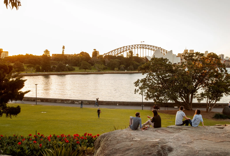
4 column cards with images
Horizontal cards
Lorem ipsum dolor sit amet, consectetur adipiscing elit. Donec a efficitur enim. Mauris sed odio pulvinar, ultricies felis et, scelerisque diam. Mauris porta fermentum quam, a aliquet mi bibendum eu.
Lorem ipsum dolor sit amet, consectetur adipiscing elit. Donec a efficitur enim. Mauris sed odio pulvinar, ultricies felis et, scelerisque diam. Mauris porta fermentum quam, a aliquet mi bibendum eu.
Horizontal cards in Brand Dark
Lorem ipsum dolor sit amet, consectetur adipiscing elit. Donec a efficitur enim.
Lorem ipsum dolor sit amet, consectetur adipiscing elit. Donec a efficitur enim.
Horizontal cards in Brand Light
Lorem ipsum dolor sit amet, consectetur adipiscing elit. Donec a efficitur enim.
Lorem ipsum dolor sit amet, consectetur adipiscing elit. Donec a efficitur enim.
Download Cards
Download cards can be added to provide a download link for a PDF document in a card format. The card image will be generated from the first page of the PDF, otherwise the cards will be available in the same configurations as other Card Lists.
View the guidelines for the NSW Masterbrand category.
View the guidelines for the NSW Co-Brand category.
View the guidelines for the NSW Independent brand category.


